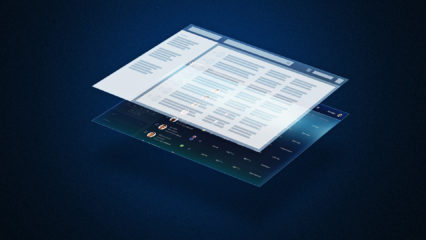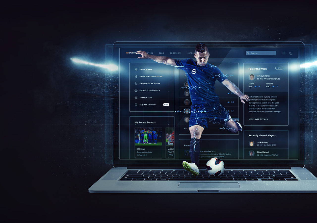
Last month we released an entirely new version of our Player Recruitment Platform Insight. We enriched our platform with new features and functionalities, to make sure that you can flag interesting prospects even faster. Changes to our platform include additional stats and filters, expected goals and league indicators, but above all, a newly fresh look and feel.
Challenge
We wanted to be able to design and develop a new platform with a compelling user experience within a short amount of time (release within 6 months). The first version of Insight was built with a total focus on the ability to scout players. This made it usable but it wasn’t recognizable or super user friendly. The challenge here was to re-build and re-design a user-friendly platform, which would be recognizable and easy to use by different level of users.
Approach
The sheer amount of information and wishes of the platform needed a structured approach of design. We started with a discovery phase in which we’ve researched the different needs and functionalities. By interviewing and hosting brainstorm sessions with different stakeholders (internally as well as with clients) we got to a prioritized list of features. Within SciSports there’s an amazing load of ideas of what our platform should look like, so we had to narrow down all ideas to a MVP (minimum viable product) of the platform. This overload of ideas is great for a designer tho, for it outlines the greater idea behind the product and gives a clear view of future possibilities.
By creating useflows we gained direction. This also gave us some requirements on the design. Our stakeholders serve as a base for user personas, which enables us to enhance our decision-making process. It had to be logical, relatively flexible, scalable and quick to release. This led us to make use of a design system, material design, to speed up the process.
Material Design is a unified design system, meaning it was made to work with all available today’s devices and platforms and it pays attention to every detail of its components so they can be used universally. It provides consistency that enriches the user experience and gives it a sense of familiarity. Since most rules have been laid out, it is easier to establish hierarchy to information so as to make it more logical and meaningful to understand by the the end user. It has a “card based” design which is great for our platform for a number of reasons: They’re easier to create a responsive website with and make content scannable. Something our users stressed a lot;
A design system is only valuable if we stick to a design philosophy and the values that we implement in our design process.
Philosophy
This design philosophy serves as a guideline. It provides direction and guidance for all our designers.

1. We create a consistent experience
By using this design philosophy, the customer will have a consistent, user-friendly, seamless and distinctive customer experience.
2. Keep it simple
- Be consistent in patterns; If it has the same function, it has the same form and visual vernacular
- Keep the clutter to a minimum; Remove all non-essential elements
- Create focus; Single flow & one thing at a time
- Reduce digging; Use a flat navigation with few levels as possible
3. Guide the user
- Action and reaction take place in the same viewport; Changes in the UI are visible to the user
- Never leave me hanging; Give me a natural next step that helps me
- Prevent errors; keep potential errors to a minimum, flag or eliminate actions that lead to an error
4. Data drives decisions
- Function over form for data visuals: Make sure our visuals tell the story correct
- Design flow for data visuals is always: Datateam -> UX -> Front end
- Use what we know of a user, but always let a user decide what we use
5. Follow standards
- Make it recognisable as a SciSports product
- follow AA standards for Accessibility, use the vue library, use material components
- Make it responsive
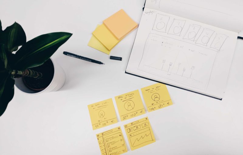
By defining our values we could also start designing and experimenting. Loads of wireframes and mockups crossed our decks on which we tested with our stakeholders to get to a solution that would fit their needs. We were surely moving towards the yellow area of our development line: Building it.
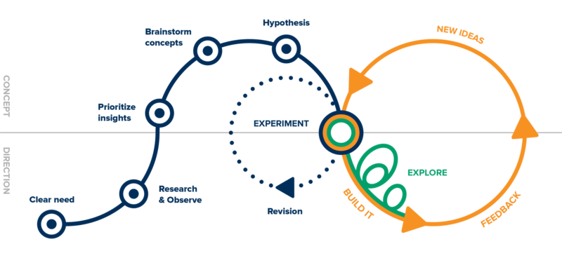
When we had our first testable items at hand we went straight to our clients to test our products and gather feedback. A key part in this process, because it provided us with the information we were missing to actually launch Insight 3.0 as a product and gave us new insights for features that would enhance our product and backlog.
How it looks
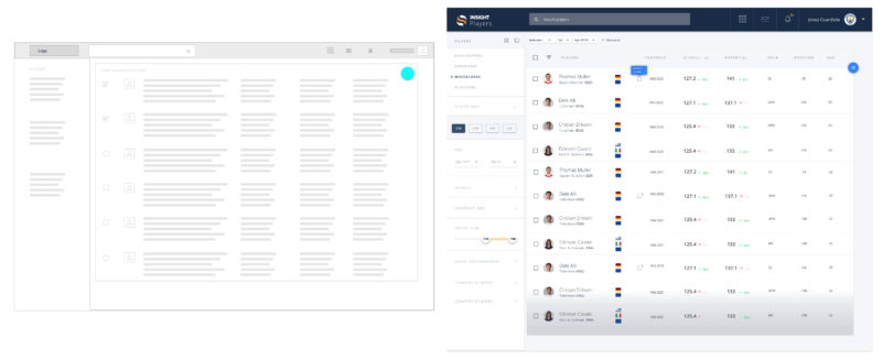
*From wireframe to design
*Card based designs for player details
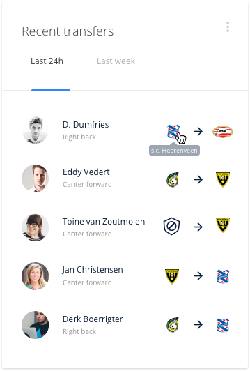
*Recent Transfers card
Future Plans
As stressed in our approach, the design of the new platform had to be logical, relatively flexible, scalable and quick to release. Now that we’ve released Insight 3.0, we can easily add new features by reusing design components and following our best practices from our design process and improve on lessons learned.
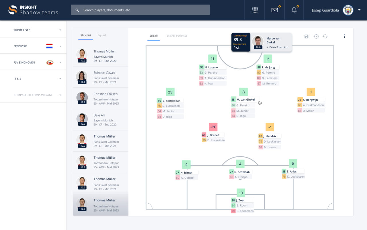
One example of an upcoming features is called “Shadow Team”. Based on feedback of our clients we identified the need to analyse the strengths and weaknesses of their squad as well as the impact of potential signings on this squad. Research and observations indicated that our clients are used to address similar needs by the visualisation of the squad on a pitch.
Together with other observations this provided us with a good starting point for brainstorming concepts to address the needs and eventually building designs for the most fruitful concepts. These designs were discussed with some of our clients, which led to a final design (see the screenshot below). Currently Shadow Team is in development and will be tested again with our clients to gather additional feedback before we release the final feature in Insight.
SCISPORTS PLATFORM
SCISPORTS PLATFORM

SOFTWARE DEVELOPERS
SOFTWARE DEVELOPERS


