
In this blogpost we take a look behind-the-scenes with one of SciSports’ developers, Coen Hallie. Coen works on the second generation of SciSports’ platform and is specialised in producing complex user-friendly visualisations for data analytics modules.
What’s your name and what do you do at SciSports?
My name is Coen Hallie and I’m a front-end software developer at SciSports. I primarily work on the second generation of our SciSports platform which is built using the Vue.js front-end framework. I am specialised in producing complex user-friendly visualisations for data analytics modules by working closely with our data scientists and designers. Knowing that these visualisations support Football Professionals at the biggest football clubs in the world makes this an exciting process to be involved in.
What library do you use for building your visualisations?
Historically our development team used Echarts as our visualization library. Echarts performed well when producing relatively simple line and bar charts. However, producing more complex visuals for the more advanced analytics modules required time-consuming, extensive customizations. In order to retain scalability when producing these more complex visualizations, the team decided to switch to Vega 4.
Vega 4 provides a higher-level visualization language built on top of D3.js. The beauty of Vega, in my opinion, is that the visualizations are written in JSON format, which makes speedier prototyping possible; Vega is able to dynamically generate the visualization based on the specifications defined in the JSON file using the power of D3.js.
We first considered using D3.js, however we eventually decided against it primarily due the steep learning curve and implications of continuity. When I am not able to create a visualisation, one of my colleagues should be able to step in relatively easily.
Can you give us a small example of how the code is formatted?
Most visualisations made with Vega share the same structure. In general each visualization consists of the following building blocks: signals, data, scales, axes, and marks. A Signal is a listener used to specify what needs to happen for a certain event. If you want to update your chart when you hover over it, you would specify it here. An example would be:
“on”: {
“events”: “mouseover”,
“update”: “invert(‘xscale’, x())”
}
We use it for the tooltip when you hover over our chart. You can use it to build an interactive legend where you show-hide certain line charts on a click event for example.
Data is where you specify which API endpoint you want to use to fetch your data. You can have multiple Data definitions that can be used for example if you want to combine a line and bar chart with both different data (like different API endpoints). If needed you can also transform the data directly within the data definition.
For example if you only want to show players above a certain age, you can define it like this:
{
“type”: “filter”,
“expr”: “datum.player_age > 25”
}
Where ‘expr’ refers to the expression you use for a certain filter. Vega utilizes their own basic expression language for writing basic formulas.
The third building block of visualization is Scales. Here you map certain data values (time, color, numbers, etc) to a visual representation. You can for example define a range of colours which can be used for a heat map for example. Currently we use it mainly for defining what data to show on both the x and y-axis. Our axis dynamically scale based on the data from the selected player.
For the Axis definition, we define some visual properties like axis colour, width, number of ticks, etc.
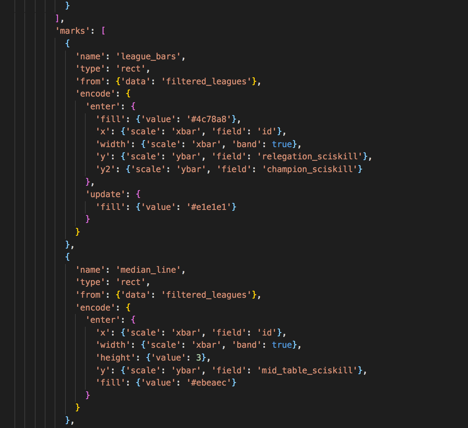
For the final definition Marks I’ve made a screenshot that highlight two Marks used in our visualization which can be seen in the GIF further below. In the ‘from’ property you specify what data you want to use, here I used ‘filtered_leagues’ which is a Data definition that has an API endpoint that can be accessed using the ‘field’ property which I use for the x- and y-axis.
The y and especially the y2 axis property is interesting here, it defines the top and bottom of each individual bar in the bar chart. Each has its own ‘API endpoint’, so it dynamically sizes the bar based on the fetched data, which is pretty powerful. The second mark called is used to show a line in each bar that represents the median.
So having experienced the transition from Echarts to Vega I have the following main points which I think are important to consider:
- Knowing what kind of visualizations is expected, especially on the long term.
- Check if there is a community where you can ask questions and if the library is actively maintained.
- Don’t decide on a visualization library based on some attractive example visualizations from for example Echarts and Highcharts. Being able to fully customize a visualisation is often more important.
Sounds great. Have you got any nice examples you could show us?
As we are still in the early stages of creating visualizations, I can show one example that shows the customizations that are needed.
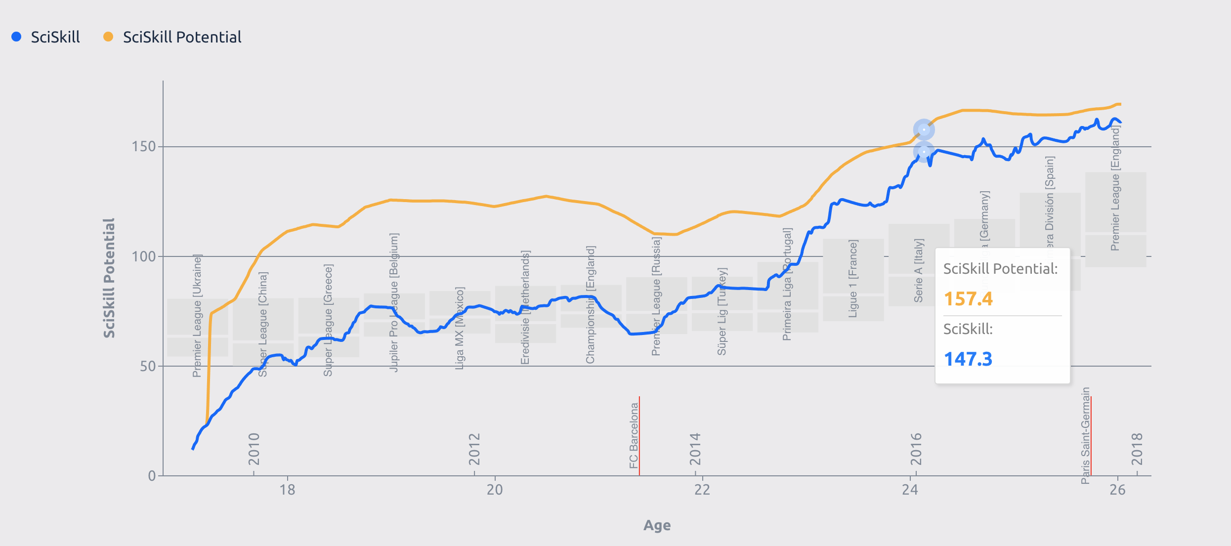
You see we have a simple line chart that uses data directly from our API, and in the background you see a bar chart. The bar chart displays several leagues that is dynamically loaded based on the performance of the player, that way it is easy to see what league he is able to compete in.
What do you have planned for the future?
On the front-end side, we are still developing the platform, so enough work there. On the visualisation side, I personally think showing accurate match replays using a scatter chart would be a challenging task, but with our current tools, I am confident we are up for the task. Looking forward to it!
SOFTWARE ENGINEERS
SOFTWARE ENGINEERS